Have you ever noticed those eye-catching pop-ups that appear while browsing a website? These are landing pages—powerful tools that can boost leads and conversions for your Shopify store.
Creating an effective landing page isn’t just about design; it requires strategic planning and attention to key elements.
With over 4.80 million websites running on Shopify, only a fraction truly stand out. As a Shopify expert, I’ve analyzed countless landing pages—some great, others not so much.
In this post, I’ll share insights from my experience, covering the benefits, essential components, and best practices to help you craft high-converting landing pages for your store.
What Is A Shopify Landing Page, And Why Put Extra Efforts?
A Shopify landing page aims to make the user take some action. Unlike other pages on a website that are for information, a landing page serves the sole purpose of getting a lead or a sale.
The people that end up, or in this context, “land” on a landing page are looking for something – a discount, coupon code, free trial, signing a newsletter, downloading/ordering a sample, etc.
As an e-commerce entrepreneur using Shopify, you must have a landing page that performs well to get more leads and, eventually, customers.
Benefits Of A Shopify Landing Page in 2025
While stitching all the elements for the perfect landing page, what are the benefits that it can give you?
- Generates leads
The first important benefit you gain from having a converting landing page for your Shopify store is increased leads. Every new visitor who visits your store won’t leave you empty-handed.
They will either shell out information about themself and their location or sign up for your newsletter if interested.
- Improves brand awareness
Building a potent landing page indirectly spreads the word about your product or store. Free trials, special access, and offers help form an image of the brand.
One user benefitting from your product or service would share the link/code with their known ones, thereby multiplying the reach.
- Increased conversions
Ultimately, what matters is conversions, and adding landing pages to your Shopify store can give you just that.
A well-crafted landing page will probe the user to know more about the products you sell and make sure that every website visit counts into a sale!
Some Common Types Of Shopify Landing Pages
Landing pages do not come in a single fixed format and have various types. Each type of landing page serves a different purpose, with variations in content, format, and action required from the reader.
Here are some common types of landing pages:
1. Lead Generation Page
One of the most prominent ways to increase the prospect of customers. It does so by asking for the customer’s information. Commonly obtained in this type is a name, email, phone number, location, and other relevant information.
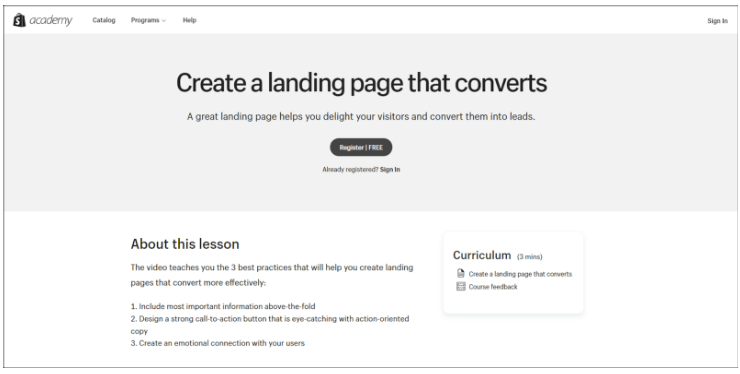
Take the above image as an example. The landing page is for a 3-minute lesson on creating a converting landing page, which allows access only upon registering, a classic example.
2. Click-Through Landing Page
A click-through landing page is exactly what it sounds like. It directly lets the user take a specific action, like signing up for a trial or trying out a demo without an information form.
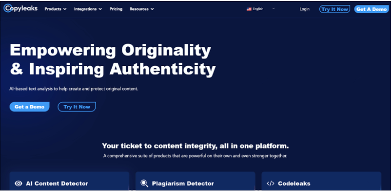
Check Copyleak’s landing page above; for example, one button asks the user to get a demo, and the other lets the user try it immediately. In both ways, a user is compelled to take an action.
3. Splash Landing Page
A splash landing page is a page that flashes before the main content of your website. The content on a splash page can either be an announcement or a verification of age or location for a few websites.
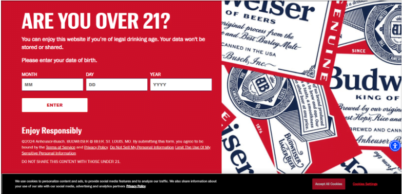
As an example of this type of landing page, check the splash page I landed on when I searched and entered the Budweiser website.
This can be an effective way to verify and relay a particular piece of information about your Shopify store products.
4. Product Landing Page
Product landing pages are pages that give out critical information about your product and narrate its story, features, and benefits with a smooth blending of compelling CTAs throughout.
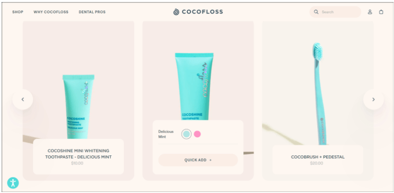
This Cocofloss product landing page perfectly demonstrates what it stands for while also nudging the user to take some action.
5. Seasonal Landing Page
Quite similar to a click-through landing page, a seasonal landing page is crafted for a specific occasion. Here’s an example of a landing page during the Hostinger Black Friday deal on their website.
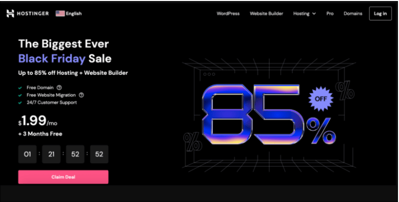
Other seasonal landing pages can include festival offers, holiday offers, etc.
These are some common types of landing pages that you should include in your Shopify store. However, do not be rigid; try out multiple variations and see what works best for your store.
How To Create A Shopify Landing Page That Works?
With the knowledge of Shopify landing pages now, let’s head towards knowing how to build one thoroughly.
In the upcoming section, I’ll be sharing the ways you can build a landing page for your Shopify store, some crucial elements to focus on, and a few great examples of existing Shopify landing pages.
3 Ways To Create A Shopify Landing Page
You can create a landing page for Shopify in 3 ways. Two of them allow you to be creative and develop a Shopify store yourself, and the other requires delegating to a professional.
Here’s an elaboration on them:
1. Use The Official Free Shopify Theme Editor
The very versatile Shopify theme editor can help you create a landing page if your requirements are basic.
Here’s an example of how I built a seasonal landing page for my Shopify store within a few minutes. For a persuasive description, I used Shopify’s AI assistant, and for the image, I used Microsoft Copilot’s Designer GPT.
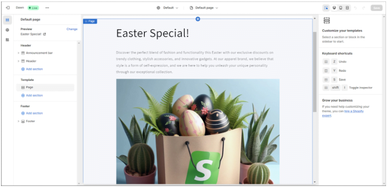
However convenient, this method of building a landing page is at times limiting, and you need external resources like templates or sound coding knowledge on HTML, CSS, and Liquid to customize your landing page further.
2. Use An External App Or Service
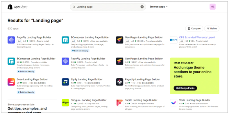
Some of the best Shopify apps can also do the work for you. Shopify has over 630 apps for building landing pages. This selection includes both free and paid apps to build your converting landing page.
But check for their ratings and reviews before downloading it for your store.
3. Hire An Expert
The next best thing is to hire an expert if you cannot invest your own time in building the landing pages. However, this method can be more expensive than the other two above but will save you the time and effort required.
5 Key Elements Required To Build A Shopify Landing Page
Irrespective of the method you choose to build a Shopify landing page, here are the key elements within the focus that you should focus on. If you decide to hire an expert, you can make sure that the work you deliver is correct.
1. Crisp Content Above The Fold
The content above the fold has to be precise and should give a glance at the content below the fold. The fold can also include the CTA at times, depending on the device that a website is being used.
Hence, the content above this part should be very precise and crisp.
2. Persuasive Landing Page Copy
Next comes the main aspect of a landing page, which is the copy. What and how you write the content within this space would decide a potential customer’s action.
The thing to focus on within this section is the voice of the content and its adherence to the brand voice, but it should be highly engaging and persuasive.
Headlines should be punchy and bold so as to grab the reader’s attention.
3. Align Color Theme And Images
The colors and images should also be well aligned with the brand colors and images. Ensure you use the same font, brand colors, logos, or elements that define your brand.
This practice is important because otherwise, the landing page would be perceived as unaffiliated with your brand and can hamper the whole purpose.
4. Include User Testimonials
Having a real user experience and reviews on your landing page drastically improves the chances of a conversion. Include a couple of positive testimonials with a link to all reviews received.
Most users scan for user reviews before making a purchase. But if you include them yourself, it will contribute to building trust.
5. Call To Action Buttons
The last key element your landing page should have is the “Call To Action” button. This button is the one through which a user is going to take; they can ask for further information, registration, subscription, or anything else.
Pay close attention to the placement of a CTA button on your landing page. Do not fix it at a single spot; try incorporating it throughout.
5 Examples Of Creative Shopify Landing Pages
Here are 5 examples of how current Shopify stores are using landing pages on their store. These include good and bad, both examples of a balance.
While these examples are shown only for representation purposes and are not to show the ideal way to build a landing page, they include most of the things I’ve mentioned in this post.
Get ready to be inspired!
1. Miss Boon
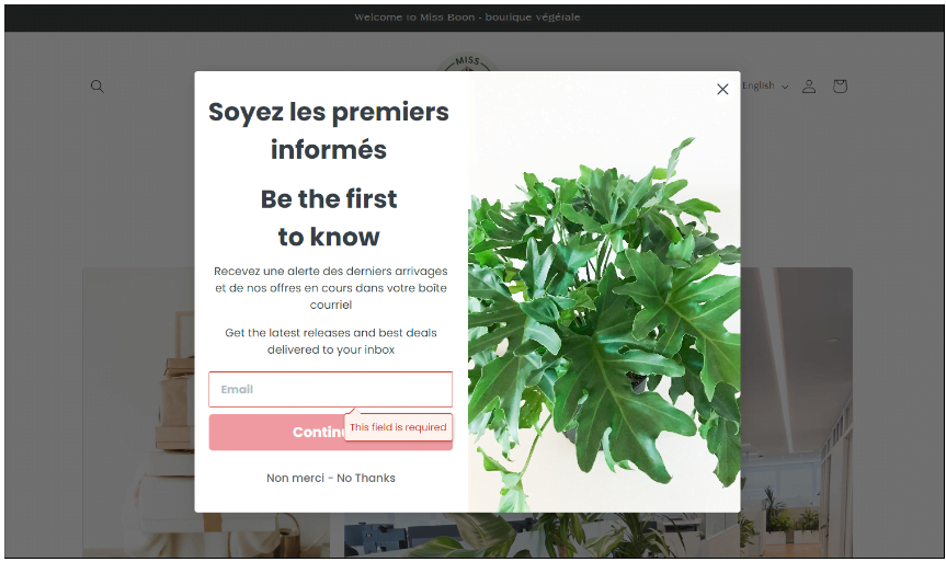
This home decor Shopify store – Miss Boon, shows a pretty good example of a lead generation landing page. The page caters to both French and English readers with a clear CTA button.
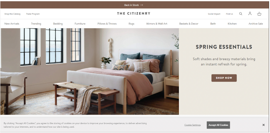
2. The Citizenry
The next Shopify landing page is an example of what a seasonal landing page should look like. Here, they are showcasing their spring-specific products with a CTA button to buy.
3. Allbirds
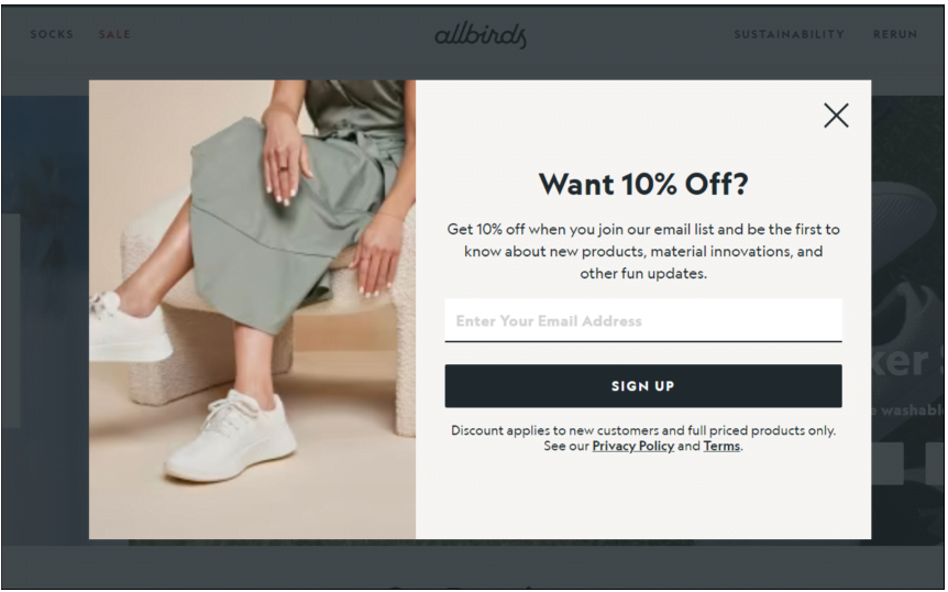
This landing page upon visiting offers a 10% discount upon signing up. But if you notice, the image being used here is blurry and doesn’t align with the overall aesthetics of the brand.
4. Hardgraft
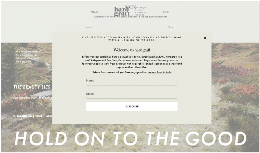
The Hardgraft Shopify store’s landing page takes extra effort. It first gives out information about the brand and then asks a user to take a look around the store and get in touch.
This is another great way to build trust and generate a lead from the visitor.
5. Nona
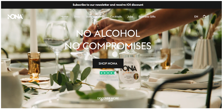
The final Shopify landing example incorporates more than one element of a landing page. On the top, there’s a CTA button to subscribe and get a discount.
In the middle section, there’s a written copy with an accurate description of what the store is. Next, there’s another CTA button, and their customer reviews on the popular platform Trustpilot are right below.
Best Practices To Follow For A Unique Shopify Landing Page
Now, after looking at how others are building their landing page, learn the best practices to follow and things to avoid while developing your own landing pages.
1. Write Value Content
Ensure headlines are catchy and the content within aligns with user needs, too!
While writing the copy for the landing page, highlight the benefits with a user’s pain points in consideration.
2. CTA Button Type And Appearance
Include only one type of CTA button within the landing page. Do not bombard the reader with too many things at once. Get creative and build the CTA button to look attractive and clickable.
3. Check Analytics
Checking insights and analytics allows you to understand what’s working and what isn’t. Check the device you get the most traffic from and optimize the landing page for that website.
4. Explore New Ways
While the best practices work for a majority, you should try different things to find a bespoke solution for your unique Shopify store.
While analytics can help you track customer behavior, it can only show past data. You never know what might work; hence, keep experimenting!
Related Post:
Bottomline: Build Landing Pages, Boost Sales
Equipped with the knowledge and examples above, you can now begin building a landing page for your Shopify store, no matter the method used.
Consider the type of landing page that would align well with your buyers’ needs, include the key elements listed, and follow the best practices to move the needle for your Shopify Store!
I recommend you start with an open mind, be as creative as possible, and not leave any visitor empty-handed from your Shopify store. Share your experience of building a landing page in the comments section below.
FAQs
A Shopify landing page is a standalone page designed to drive specific actions like sales, sign-ups, or lead generation.
A landing page helps increase leads, conversions, and brand awareness by focusing visitors on a single call to action.
Clear headlines, persuasive copy, strong visuals, testimonials, and a compelling call-to-action (CTA).
Yes! You can use Shopify’s theme editor or third-party apps to design landing pages without coding skills.
Lead generation pages, click-through pages, product pages, splash pages, and seasonal pages are the most effective.
